![]()
![]()
![]()
![]()
![]()
![]()
![]()
![]()


by Rob Newhouse
Analytics & Measurement Consultant
16 November 2016
‘Web usability’ means how easy it is for someone to use and navigate a website. Although it is quite a broad term, web usability can be narrowed down to a few key aspects – the simplicity, consistency, familiarity, relevancy and accessibility of a site. In short, website usability is essentially focused on making a website more user-friendly.
Although improving website usability & engagement should be a priority for any business, many sites have issues that cause inconvenience to the user and their experience on (and of) the site.
Here are seven essential tips that you can take to improve usability on your website:
1. Reduce page loading times
It is possible for users to be ‘put off’ visiting your website before fully loading the page.
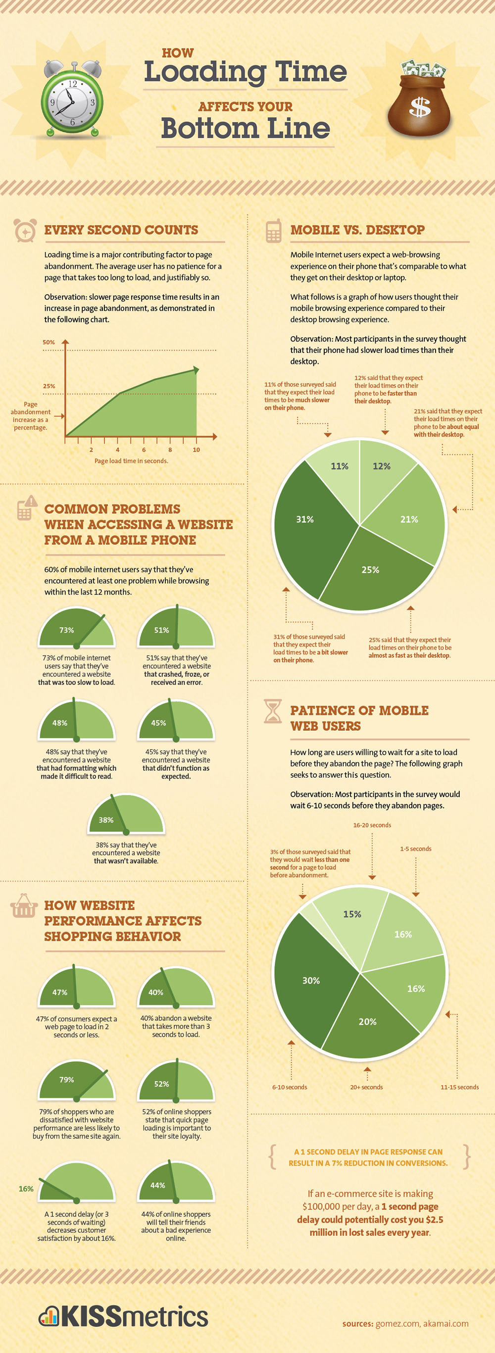
A slow loading time is arguably one of the most frustrating experiences on the web and the average user expects a page to load in less than two seconds. Any longer and users will abandon the site and visit others – usually competitor sites.
According to a survey by Kissmetrics, 40% of shoppers will abandon a website that takes more than three seconds to load.
One way in which you can reduce page loading times is by optimising images. By reducing the file size, and scaling them to the right size before uploading them to your site, the images will load faster and will not slow down the loading of the rest of your pages. Other initiatives, such as optimising CSS files and browser caching, can also help the page to load faster.
2. Maintain consistency across your site
Consistency is the most vital factor you need to consider when improving the usability and design of your site. Maintaining a similar layout on every page will make the user more familiar with your site.
The Mediahawk site is a great example of maintaining a constant theme on every page. Every page on their site maintains a consistent layout with similar fonts and colours. This consistency can reassure users that they haven’t been navigated elsewhere whilst also presenting cohesive branding.
3. Make your site responsive
In the past decade the number of mobile users has sky-rocketed: a 2015 Ofcom report found that 33% of internet users consider their smartphone to be the most important device for going online. As a result, having a mobile-friendly and responsive site is no longer an option, but is an essential part of your website’s design.
If the fact that more people now browse the internet from their mobile devices, such as smartphones and tablets, isn’t enough to persuade you to have a responsive design, then the fact that Google are penalising websites which aren’t mobile-friendly should. By failing to add responsive features to your site you could be affecting your rankings and potentially losing a large volume of traffic.
When implementing a responsive layout, you should make sure that it maintains the familiar theme of the desktop version, regardless of the device being used.
Although the layout of the site will inevitably be different on mobile compared to the desktop version, only small tweaks will need to be made to the site – such as the maximum width of the page and the size of the images and the branding: in addition, colour scheme and fonts, if possible, should all be unified. Any major changes between the desktop and mobile version will just cause more confusion to the user when visiting the site on different devices.
4. Use a familiar navigation layout
Without a simple and recognisable navigation layout, users will become confused and many may choose to abandon the website due to frustration.
It’s worth mentioning that most users favour a certain navigational layout so it is not worth trying to reinvent the wheel. Users are used to the simple navigation bar at the top of the site with links to key pages and simple, concise terms used to differentiate the pages.
Sticking to this familiar layout will make users feel comfortable when browsing your site. Although there is no strict ‘rule’ when it comes to navigation, unusual types of navigation layout are rarely successful, so sticking to a tried and tested formula will guarantee better usability.
5. Use headings and subheadings with your content
Content is a vital part of any website particularly in terms of SEO. Headings (H1) and subheadings (H2) will help break up your content and make the page look better to a user who is glancing through your site, as well as helping with your SEO as the H1 is still considered to be an important ranking factor. Instead of leading your users to heavy bodies of text, the use of headings and subheadings will instil confidence in the user that they are in the right place, ultimately resulting in the ‘long click’, increasing engagement levels.
6. Highlight your key features
Having a section which highlights your benefits/products/services, etc. is a quick way for users to gather the information which is relevant to them. Many sites also choose to use icons to make their key features or services ‘stand out’ and they can also be utilised to illustrate the key points on the page.
7. Use images – but don’t overdo it
It’s important to inform your users and customers of your services and how you can benefit them but, as mentioned earlier, be sure to not overload the user with too much text. Images are a great way to break up your content and to keep users interested in your site – remember you only have around two seconds to impress the user before they move on to another website.
Pictures are much more exciting to the average user than words so integrate them to your advantage. Instead of trying to describe a point in a paragraph, use a related image which adds to the information being presented on the page.
Although images will help improve the usability of your website, and potentially attract more users to your content, too many images, or poorly optimised images, can end up having a negative effect on your website and its usability, so use any images appropriately.
Get our news, insights & advice delivered to your inbox
Related articles

3 Simple Ways to Improve Your Marketing and Grow Your Wealth Management Business
Understanding your clients or prospects is the first step to creating a successful marketing strategy. This is why we surveyed over 500 high-net-worth individuals (HNWIs), to understand the main influences of their investment research. From this, we identified the channels they are most influenced by, revealing how you can tailor your marketing to prospects based on their preferences.

2024 vision: A look into this year’s game-changing marketing trends
Understanding your clients or prospects is the first step to creating a successful marketing strategy. This is why we surveyed over 500 high-net-worth individuals (HNWIs), to understand the main influences of their investment research. From this, we identified the channels they are most influenced by, revealing how you can tailor your marketing to prospects based on their preferences.

Revealed – The Top Channels Influencing High-Net-Worth Individuals’ Research
Understanding your clients or prospects is the first step to creating a successful marketing strategy. This is why we surveyed over 500 high-net-worth individuals (HNWIs), to understand the main influences of their investment research. From this, we identified the channels they are most influenced by, revealing how you can tailor your marketing to prospects based on their preferences.
Contact us
Call us on 01525 715 520 or complete the form below, and one of the team will get back to you.